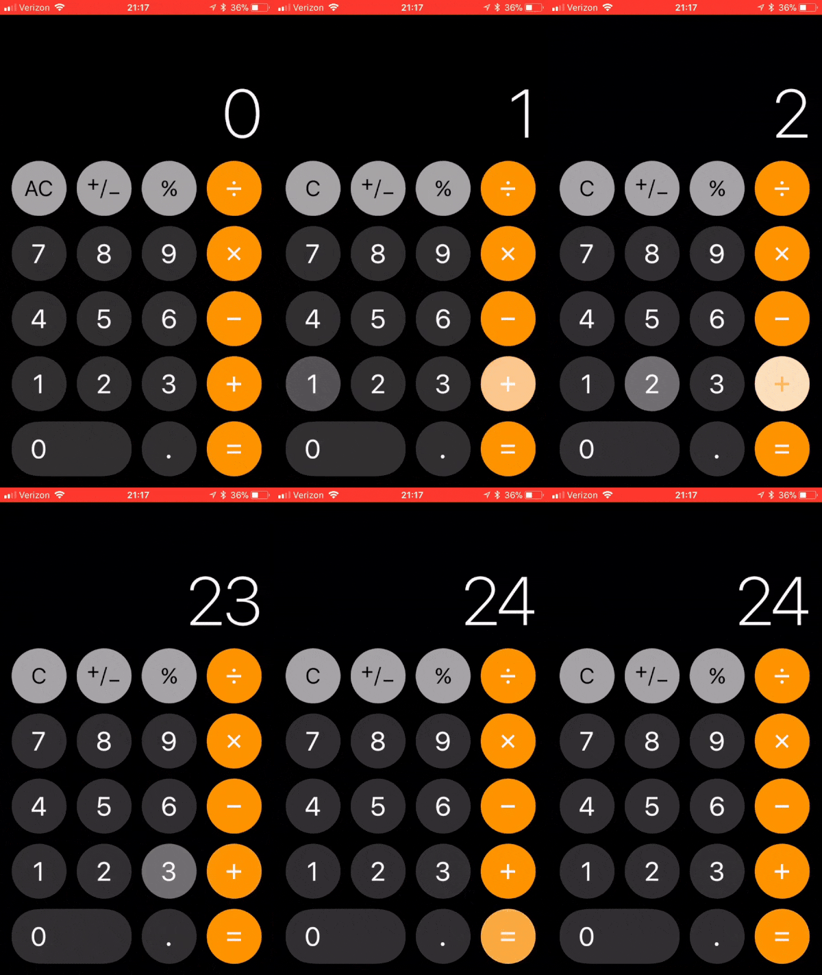
What does 1 + 2 + 3 equal to? It was 6, not anymore. Apple released its new operating system (iOS 11) for iPhone on September 19, 2017. One of the updates was a redesigned calculator app. Mid October, a post titled “Try quickly typing 1 + 2 + 3 into the iOS 11 Calculator. I bet you won’t get 6” went viral on Reddit and other social media.
I was looking forward to the next iOS 11 update, hoping that Apple would fix the issue. Nope! Today I updated my phone for the second time and the issue is still there. Note that I actually press “+” three times, but the third press is blocked by animation in progress.

Apple did reach out to me on Twitter for “more details”.
We can help. Which version of iOS are you experiencing this on? Reply in DM to get started. https://t.co/GDrqU22YpT
— Apple Support (@AppleSupport) November 20, 2017
I followed up and this was their response.
Thank you for meeting us here. We’ve heard reports of the issue you’re describing, and it’s currently under review. We don’t have a solution at this time, but recommend that you keep your device up-to-date using Software Update.
When iPhone first came out, calculator app was one of the things that made you go: “Wow, this thing will replace ALL my other devices!”. Not anymore. Recent re-design added no new functionality (as far as I can tell). It just changed the look and added animations, breaking the app in the process. I am pretty sure Steve Jobs would be pissed.
![By Acaben, modified by @akras14, cropped by Kyro (Flickr) [CC BY-SA 2.0 (https://creativecommons.org/licenses/by-sa/2.0)], via Wikimedia Commons" By Acaben, modified by @akras14, cropped by Kyro (Flickr) [CC BY-SA 2.0 (https://creativecommons.org/licenses/by-sa/2.0)], via Wikimedia Commons"](http://techtldr.com/wp-content/uploads/steve.png)
It is not just Apple
It is not just Apple though. I’ve shared similar frustrations with a lot of tech companies. Google Maps redesign a while back, butchered links to businesses. Earlier today I was looking for a local market to share with a friend. I found it on Google maps, but there was no way to get a link to it. I had to re-type the market name (now that I knew it) back into Google, to get a sharable link.
My mother had a six-year-old HP printer that she loved, but it finally died. We bought here a comparable newer model to replace it. HP removed all physical buttons (copy, scan, fax etc.) and replaced them with a tiny touchscreen. My mother keeps her printer under the desk and has poor vision. In old printer, she could press the copy button while sitting on her chair. Now she has to get down on the floor to see the copy button on the tiny touchscreen.
I was walking with a friend a few weeks back and I told him about the 1 + 2 + 3 issue. He said:
“I know exactly what you mean. Most of the apps that I use on my phone are constantly changing. As soon as I begin to feel like I finally learned the new UI, bam, the app is completely redesigned again.”
I am not against redesign per se. There are two types of redesign:
- Redesign to make the product better
- Redesign for redesign’s sake
At least the first kind of redesign aims to do better by the users. Unfortunately, from what I’ve seen, it fails to meet the mark more times than not. The second type of redesign is simply there to keep teams busy and to create a perception of value add.
Conclusion
There is a saying in Russian: “Measure seven times, before making the first cut”. There is a saying in English: “If it’s not broken, don’t fix it”. I wish more companies would do that. A large market share indicates that users already like the product. Every redesign attempt can change that and should start by honestly answering two questions:
- Do we need to do this in the first place?
- If yes, will the proposed redesign ACTUALLY make things better?
If answer is “no” to either of these questions, stop! The world has plenty of new problems to solve, focus your energy there instead.
Regarding the death part, I think for many of these products it is a slow but unavoidable process. There are only so many failed redesigns that users are willing forgive. They will ditch you when the competitors get better. Just look at Android eating iPhone’s market share. Looks like Windows may be on path to do the same to Mac.
Do you have an example of redesign gone bad? Please share it in the comment area bellow.